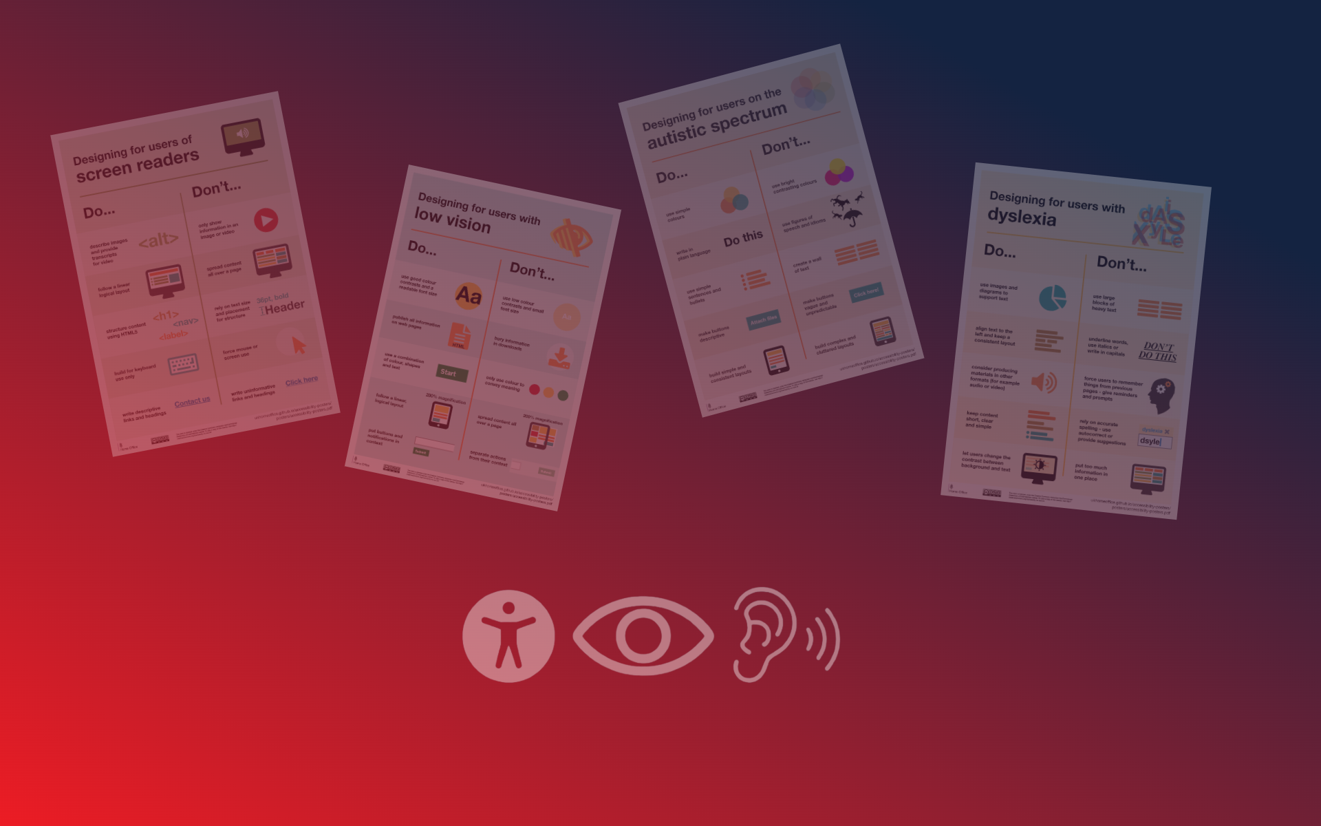
Accessibility in websites and web design is often very overlooked, though it’s super important! We shouldn’t just assume that everyone understands, interprets, and navigates the web the same way we do. We recently wrote an article a short while ago about the top 10 tips for website accessibility, especially for people designing websites. Today, I want to show you some images from the UK Home Office. They’re a bit old but still really useful. They help us see how different people need different things on websites to make them easier to use. You can check out the original images if you want more info!
Autistic Spectrum:
First, let’s talk about making websites friendly for people on the autistic spectrum. Here are a few things to avoid, and you can check out the images below for examples. If you want to skim through quickly, check out the original images.
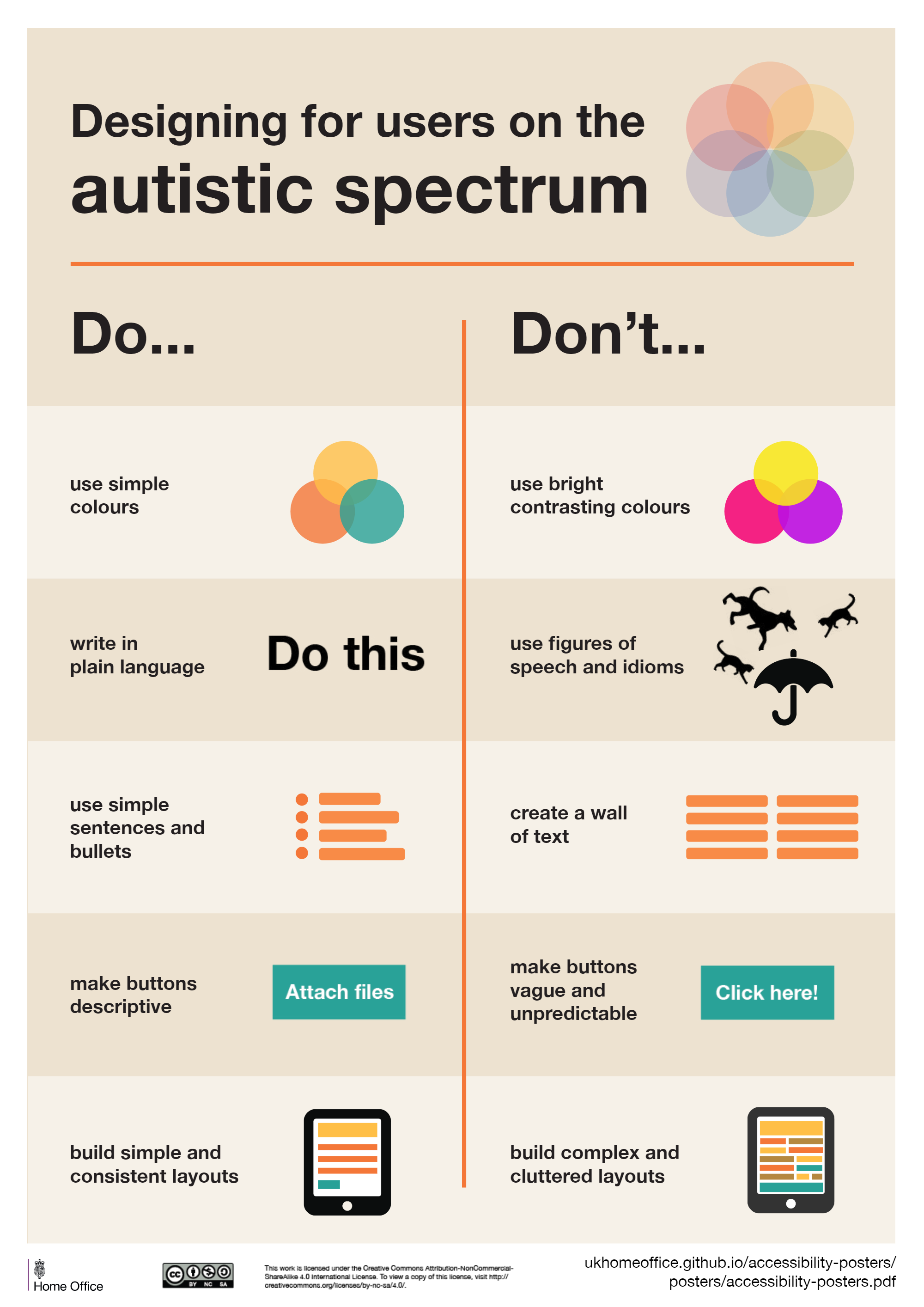
First off, don’t use too many bright, contrasting colors. There are things like color brightness that can trigger certain behavior, so just dull it down a little bit. I’m not saying go for complete grayscale, but just dull it down a little bit and don’t make it too bright. Also, keep your words simple. Fancy language can be confusing. I’ve seen websites with big, complicated words that just make things harder. I have seen some website hero banners where they’re being very artistic with their wording and I often say, just say it in a really simple way. Keep it short, concise, and to the point.
Also, don’t just dump a lot of text in one place. Break it up with paragraphs, spaces, and pictures. This makes it easier to read and understand. And when you’re using buttons, make sure they tell you what they do. Sometimes, buttons look like they do something, but they don’t. That’s confusing! And don’t use labels like ‘see more’ if it’s not clear what you’re seeing more of. Make it simple and clear.
Screen Readers for Blindness or Visually Impaired:
Have you ever thought about people using screen readers? They might have trouble seeing the screen or be totally blind. So please consider the fact that you have to accommodate this audience as well.
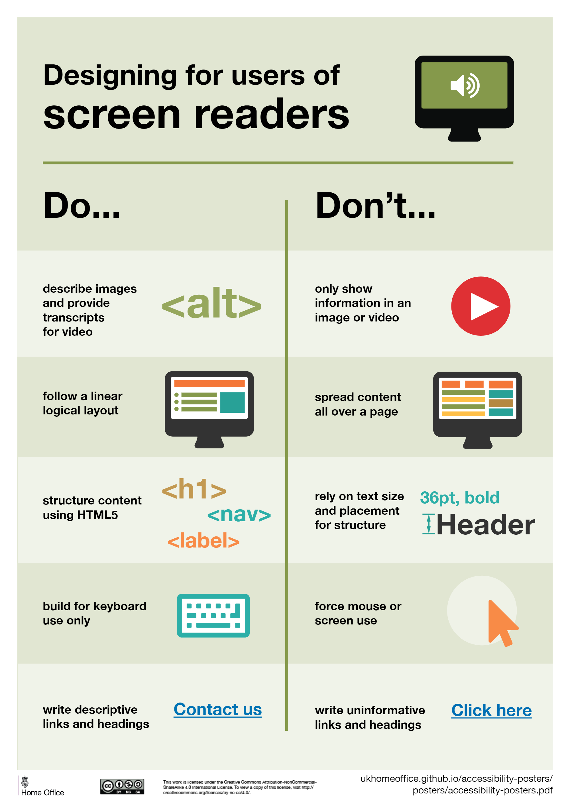
This is where the good old description that I mentioned in our previous article about web accessibility matters. Make sure your images have good descriptions. Don’t just slap on a generic filename like “imageXYZ123.” Give it a descriptive title. If it’s a picture of a cat looking at a blue butterfly, say so.
We all want our websites to stand out, but think about usability too. Keep things in a logical order for those using tabs or screen readers. It’s confusing when things jump around randomly. Semantic tags help with this—use headers, subheaders, and text in the right order.
One big tip: test your website live. Hit the tab button and see where it goes. Does it navigate through the menu correctly? Can users access dropdowns easily? Does tabbing make sense, or does it feel like chaos?
And please, avoid embedding text into images. Screen readers can’t read that, and without an alt description, users won’t know what it says. It’s a common mistake, but an important one to avoid.
Lastly, I’ve noticed some websites with text embedded into images, especially on one-page sites. Let’s try to move away from that practice.
Low Vision:
What about low vision? Well, here’s where we slightly contradict what we said about the autistic spectrum. While we advised against bright colors there, here you actually want to use them. But you’ve got to keep your audience in mind. If you’re a charity or service provider, bright colors with good contrast are crucial.
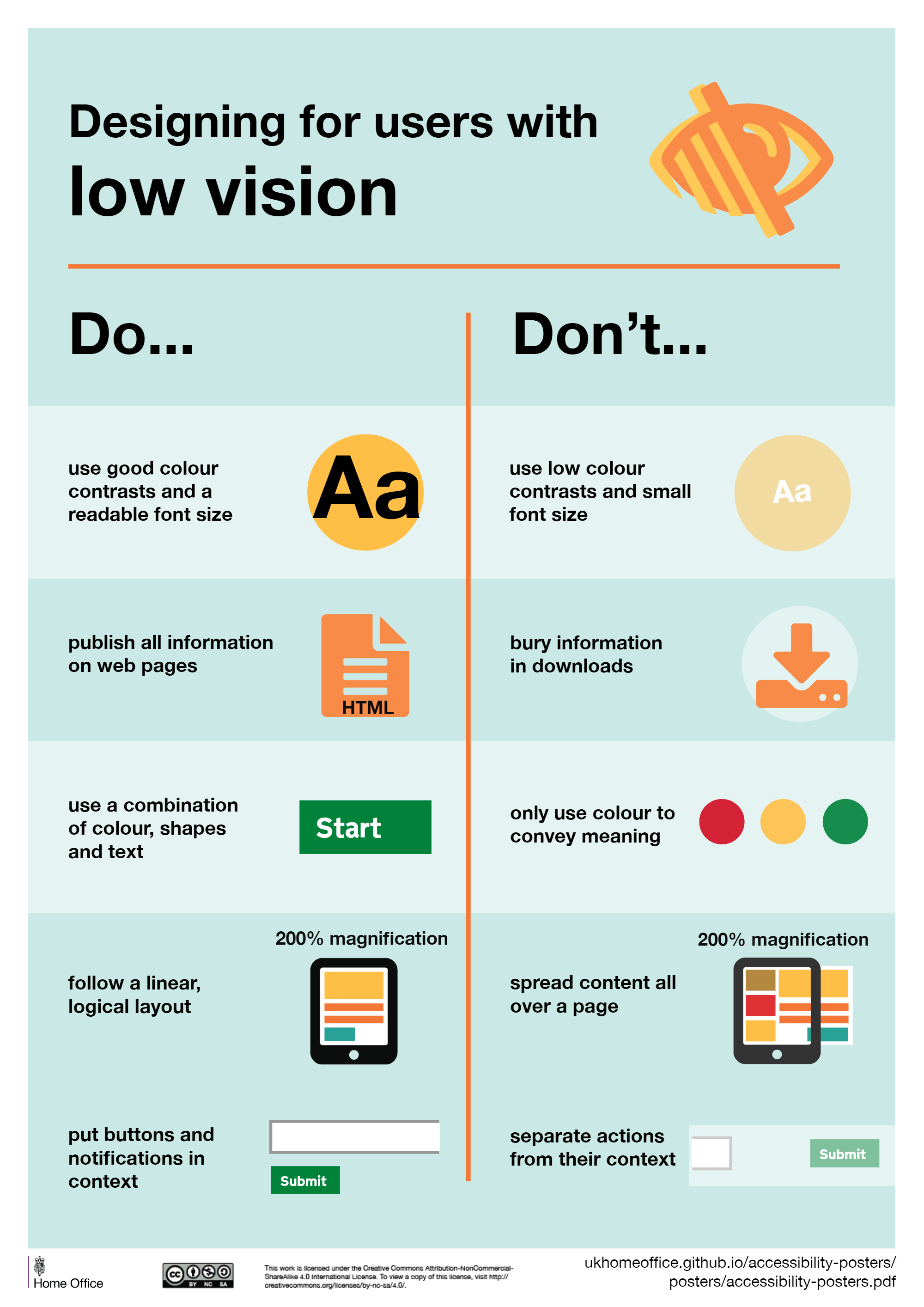
Check your color contrast with a contrast checker. Aim to get the green light on all fronts. Don’t make people click buttons to download information. Ensure everything they need is readily available on the screen. You might wonder, why not let them download it? Well, maybe they could, but it’s essential to make sure they can access everything right there. If they’re tabbing and zooming, they should still get what they need.
Dyslexia and other Visual Impairments:
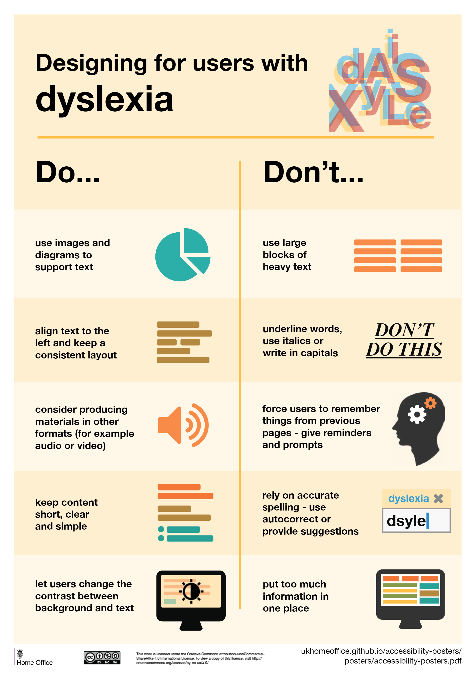
Did you know there are specific fonts designed to help people with dyslexia? Images and diagrams are fantastic for conveying information. Avoid overwhelming people with too much text. It’s a recurring issue. Keep your text aligned so it’s clear where each section begins. Avoid centering everything.
Now, here’s where we’re going to contradict a bit. While web accessibility recommends underlining links, if you think your audience might have dyslexia, avoid italics or underlining as it can cause confusion.
Using audio or videos to explain things is a great idea, especially for those with low vision or blindness. There are plugins available to zoom in and adjust contrast. Here’s a great tip: let users change the contrast on the screen. It’s something I hadn’t thought of before, but it’s highly recommended.
Mobility Impairments:
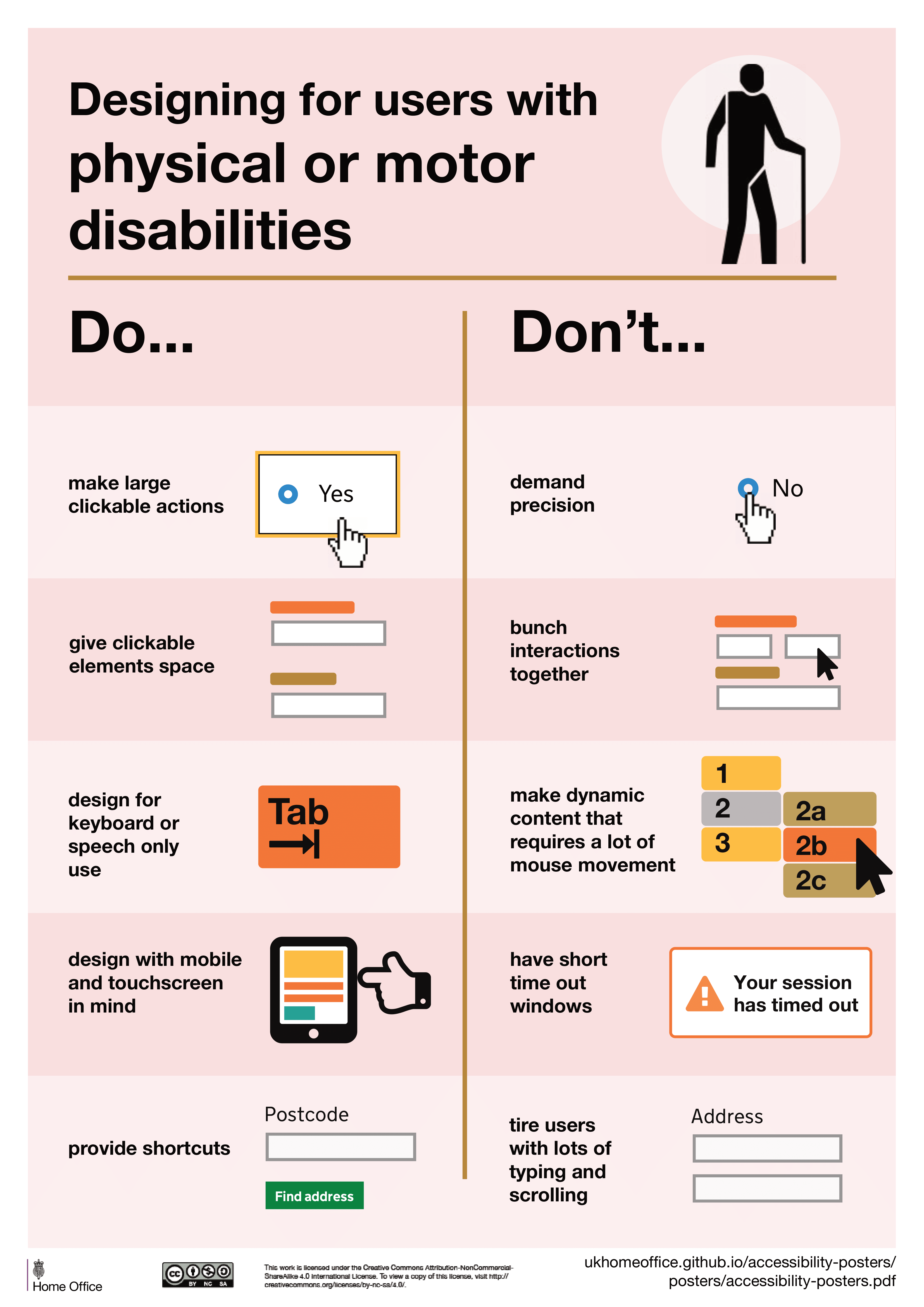
I’m sure many of us have worked with someone who has difficulty with motor skills, maybe struggling to use a mouse or click buttons. To help, minimize the need for precise mouse movements. Make buttons large and clickable, so even if they’re just tabbing and clicking, it works. Avoid using small radio buttons or checkboxes, unless they’re made significantly larger.
Imagine you’re building a website for mobility equipment like electronic wheelchairs. If you have a complex form with 20 fields, is that really fair? Simplify it. What information do you really need? Remember, they’ll get frustrated if it’s too complicated to complete.
Hearing Impairments:
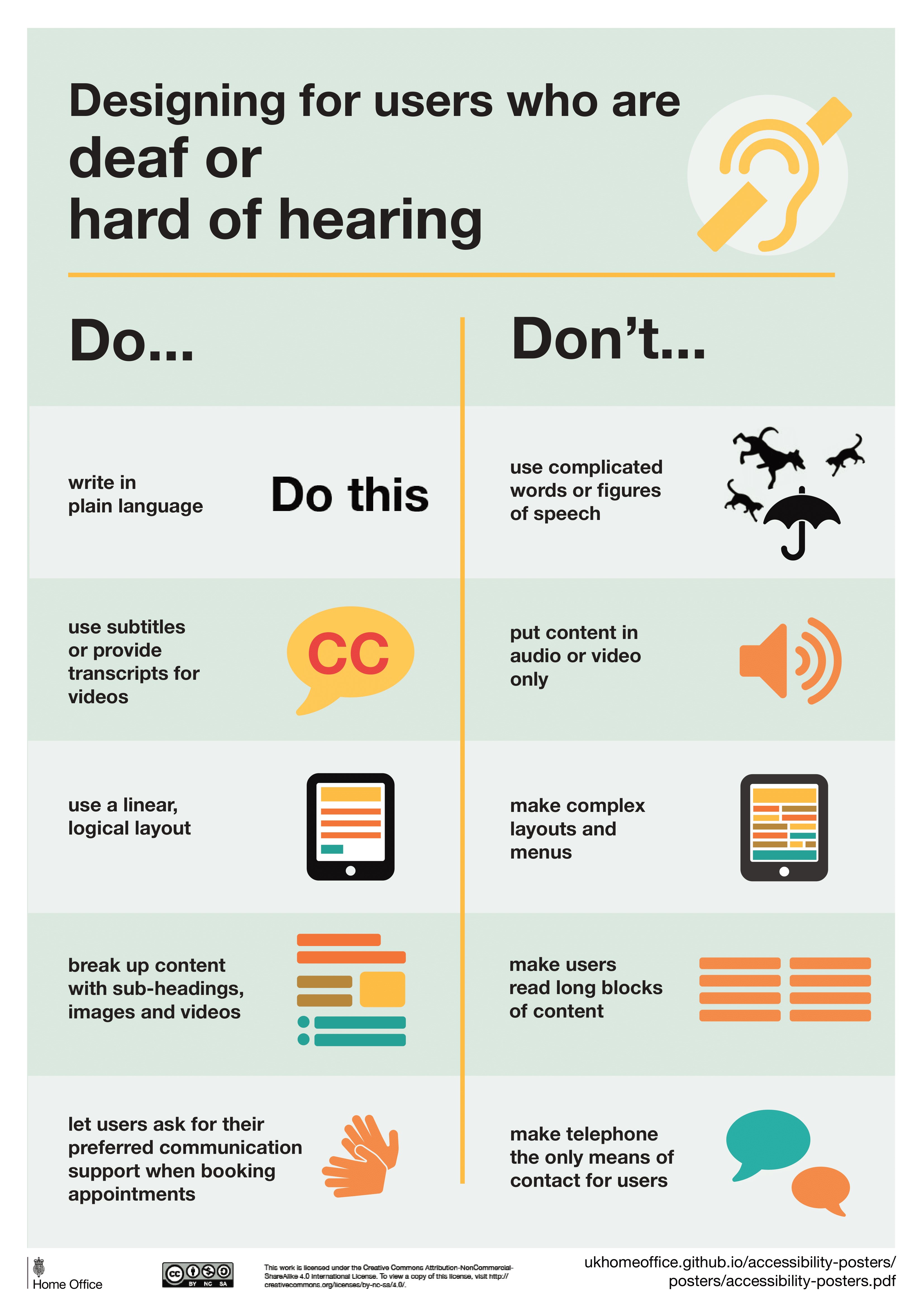
Now, let’s talk about hearing impairments. Just because someone can read doesn’t mean they’ll understand everything. Avoid overly complex language or flowery prose. Keep it simple. If you’re including audio or video content, make sure there’s a transcript available. For videos, include captions. Don’t forget, if there’s a video without captions, it’s a big miss. Ensure there’s a way for users to toggle captions on or off.
It’s a huge mistake to only provide a telephone number for contact. Offer additional means of communication, like WhatsApp or a contact form. Don’t just rely on “call me,” as I often see on many websites.
Anxiety:
When we are talking about web accessibility we aim to create websites that work for everyone, but have you ever thought about anxiety? Honestly, I probably didn’t until now. Let’s change that.
First off, avoid putting timers on websites. It’s a pet peeve of mine. You visit a site, find a product, and suddenly there’s a countdown saying you have five minutes to complete your purchase. I get it, maybe it’s for caching or urgency, but it’s frustrating.
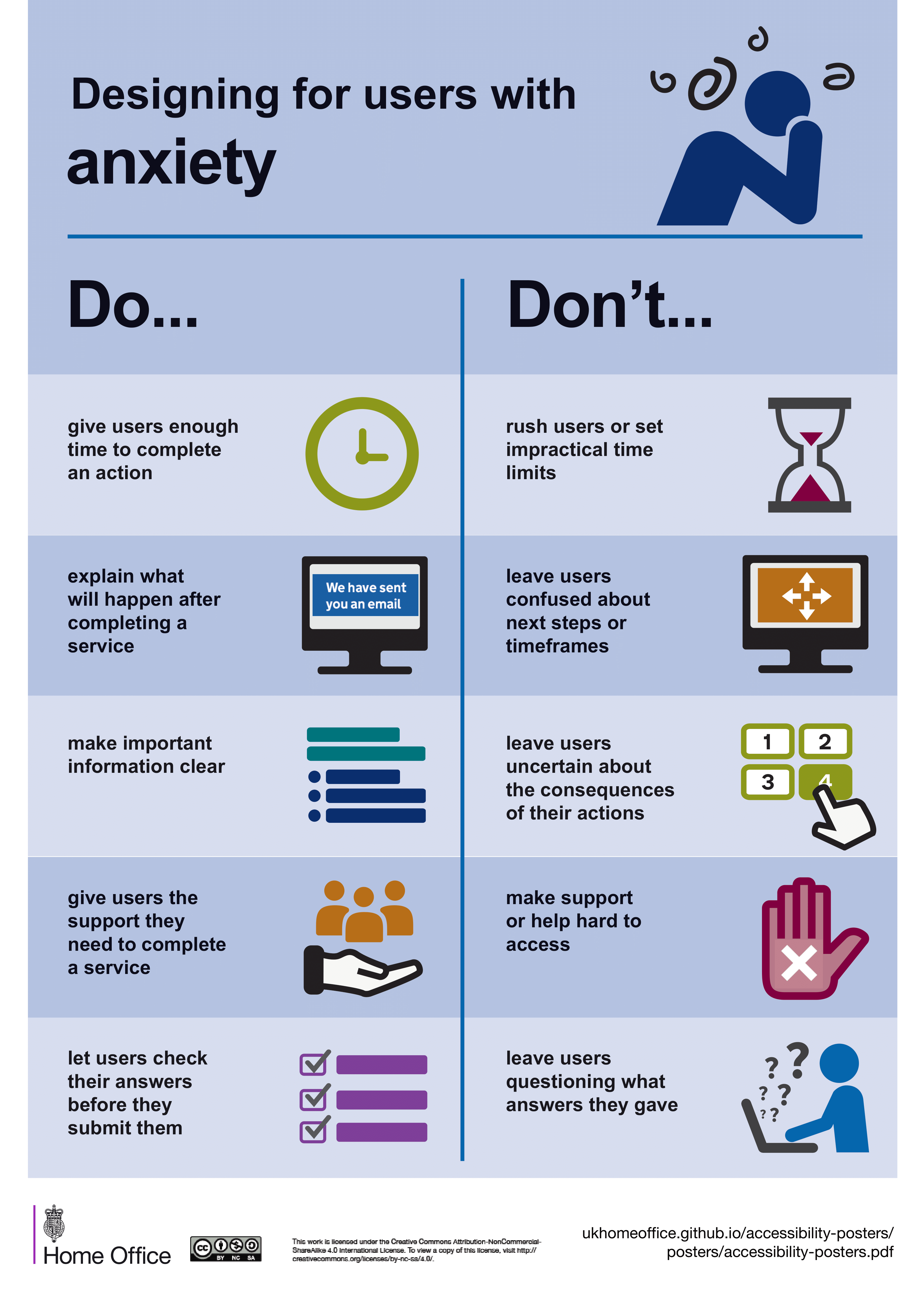
Countdowns for events are okay, though. If there’s a countdown to a sale or an event, that’s fine. But don’t make someone feel rushed to fill out a form. Consider the anxiety-inducing effect of error messages. Can we soften those a bit? Even when someone completes a form or makes a purchase, let’s give them a warm, appreciative message.
Speaking of purchases, should we display prices on websites? I say yes, but not necessarily exact prices. Give a ballpark figure, a starting point. It helps ease anxiety when people know what to expect.
If you’re using a multi-step form, let users review their progress before submitting. It’s frustrating to get to the end and realize you made a mistake back on step two. Let them go back, review, and edit before submitting.
Conclusion:
That was a lot to take in, and you might not agree with everything. I’ve shared some slides from the UK Home Office, but it’s worth exploring what’s happening in your own country. Talk to other web designers, browse forums, and gather insights.
We all have a role to play in making websites more accessible for everyone.