
Do you know what I’m guilty of, and you probably are too? It’s about making our websites more accessible. As business owners, we often focus on aesthetics, functionality, and marketing but may overlook an essential aspect—web accessibility. Ensuring that your website is accessible to everyone, including individuals with disabilities, is not only a moral obligation but also a smart business move. Can someone navigate using tabs? Are the colors clear enough or have we made the website so bespoke that it’s okay for us, our peers, and our clients?
In this blog post, I aim to share ten invaluable web accessibility tips that every business owner should immediately implement. Rather than delving into stories of websites or individuals facing penalties for inadequate accessibility, I’ll get straight to the point. While there are numerous plugins and themes available, many of them offer a mere pop-up that lets you adjust color contrast on your website. If you choose to rely on such plugins, go ahead, but don’t count on them to support you in case your website’s accessibility is challenged. Let’s power through these 10 essential tips you should consider right now.
1. Colors and Contrast
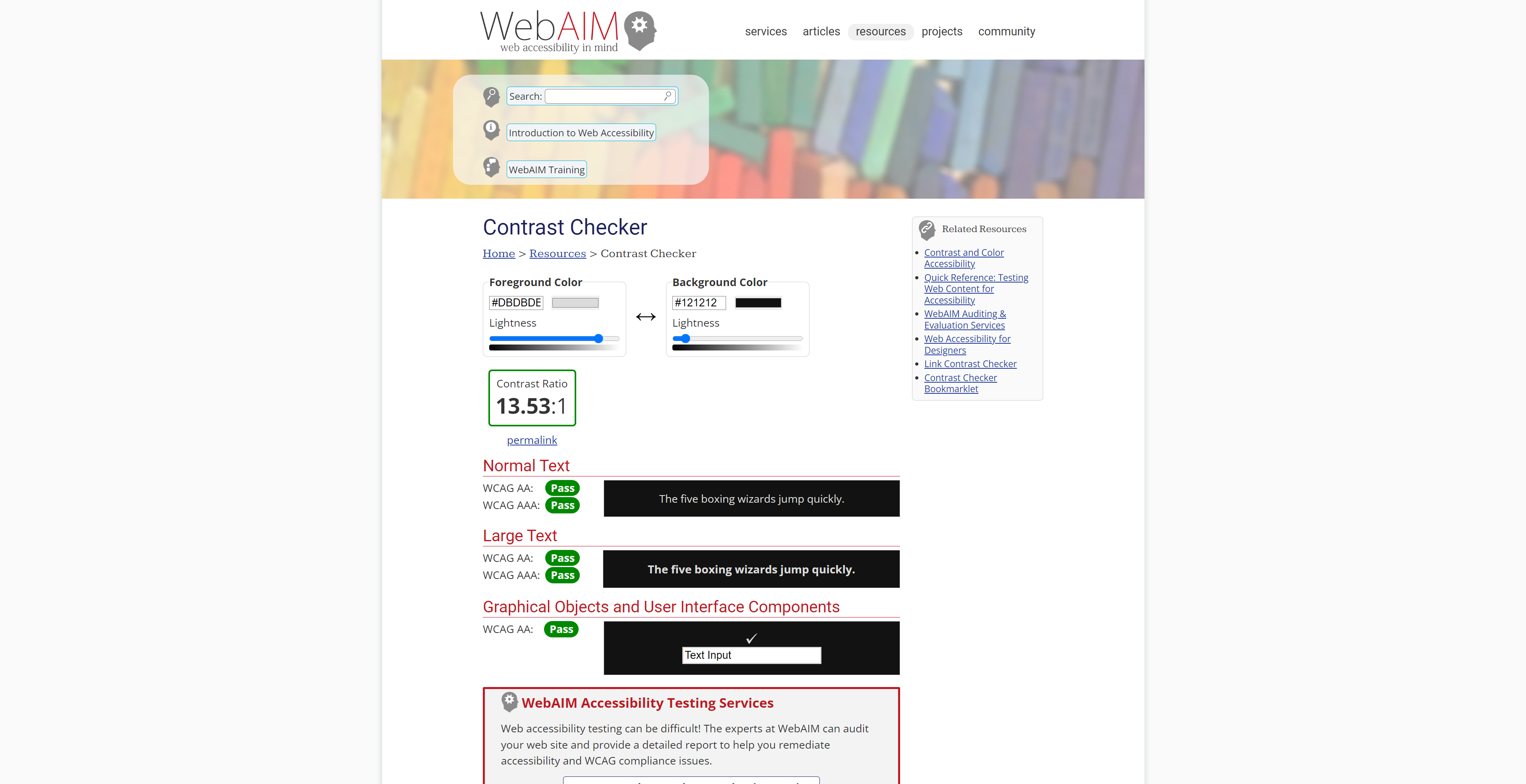
Have you taken into account the color choices on your website, specifically focusing on contrast? Consider how dark or bright certain elements appear and how they interact with one another.
I’ve come across websites that use a charcoal gray font on a pastel background, and it’s evident that this combination is challenging to read, even for me, and the situation worsens when viewed on mobile devices. Why do they do it? Well, in most cases, it’s because the owner of the website has a strong preference for it. It’s their brand color. There are various tools available for testing the compliance of your website that you can find online and I will link below.
The drawback here is that sometimes you may need to reconsider and not use your brand color for the button. You will have to opt for a slightly darker shade. While this choice might not be your first preference, I can reassure you that you are still incorporating your brand color.
2. Images and Alt Tags
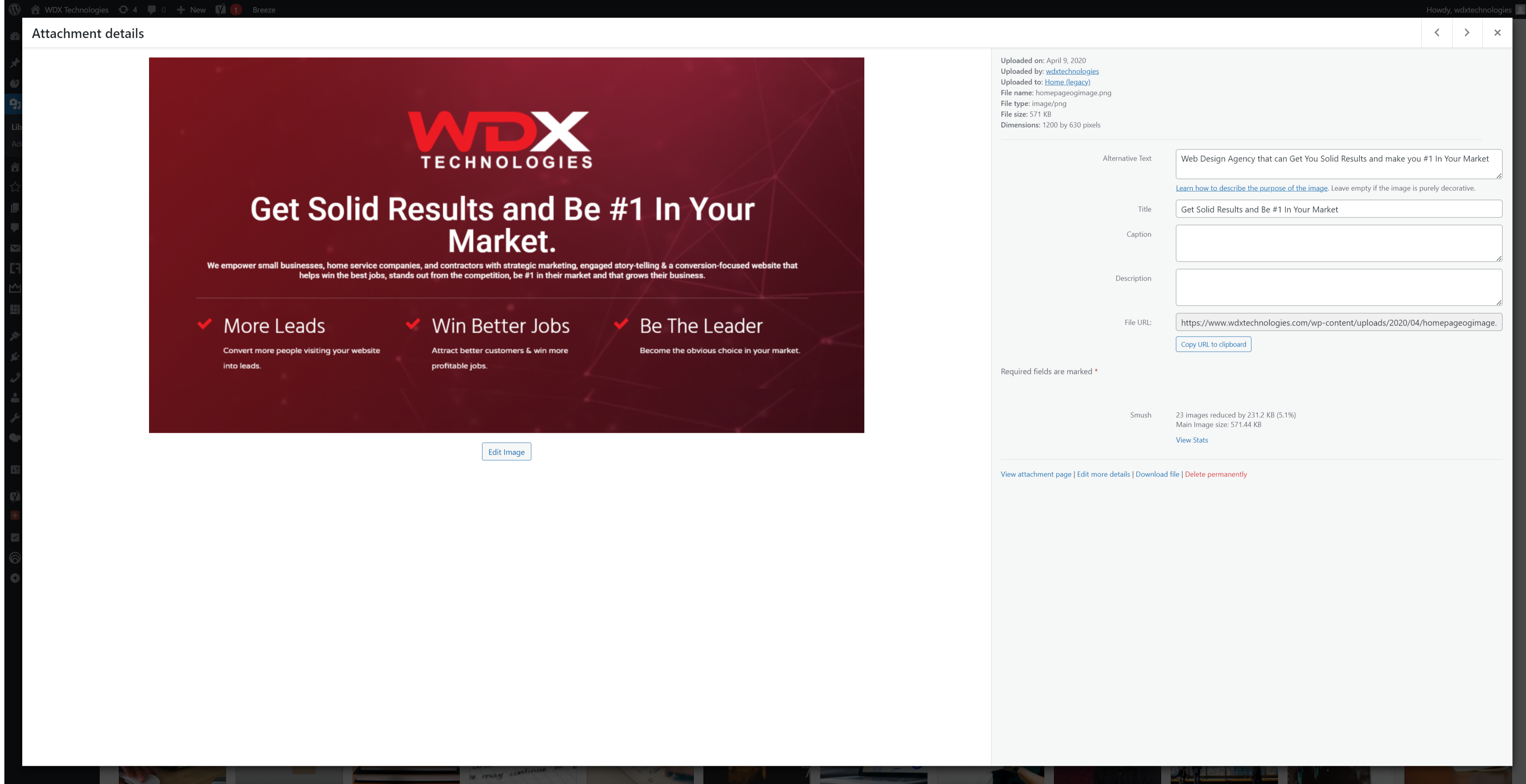
Another aspect to consider is how you handle images. If you’re concerned about SEO, you’ve probably encountered a warning stating that your alt tag doesn’t include your targeted keyword.
However, it’s essential to understand that the alt tag or alt title for your images should not solely focus on the keyword. Instead, aim to provide a descriptive text that conveys the image’s relevance to the website’s content. For instance, if you have an image depicting a man eating a sandwich, it’s more beneficial to say something like “Man enjoying the tuna sandwich released in 2023” to establish a connection with the content.
3. Hyperlinks and Underlining
The third piece of advice, which might not be everyone’s favorite, pertains to the way we often incorporate links, such as hyperlinks, within our text. We tend to use a different color to highlight them as links, but to enhance web accessibility, consider underlining them. However, it’s crucial to balance this with the overall visual appeal of your content. So, if underlining doesn’t fit your design, at the very least, maintain a distinct color difference for the links. But if you can manage to underline them, that’s even better.
4. Fonts and Handwriting Text
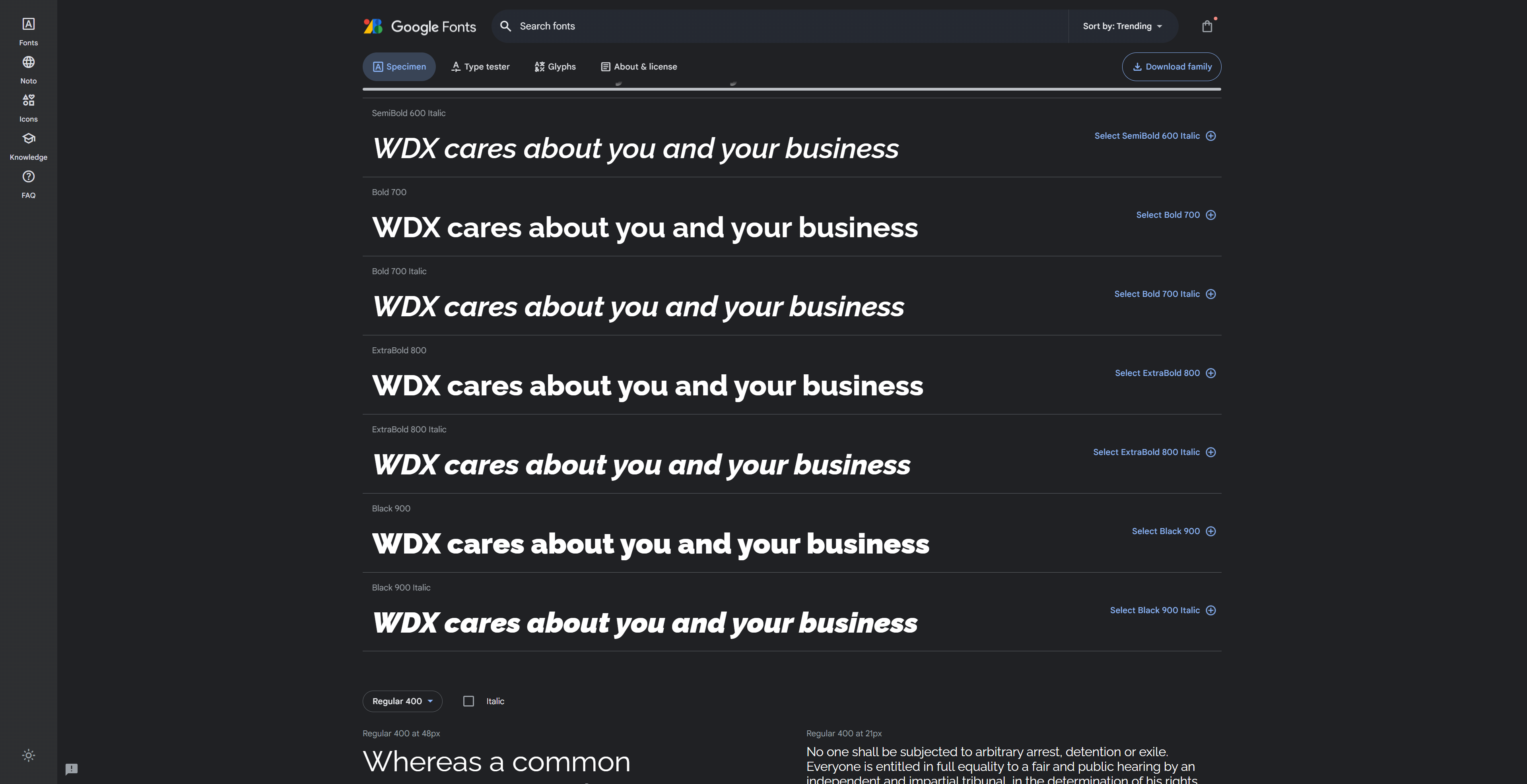
Moving on to tip number four, it’s worth addressing the use of elaborate, curly, and fancy handwriting fonts on websites. You’ve likely come across instances where websites employ these fonts like “Shadows Into Two” or similar, which, while visually appealing, can be challenging to read.
Imagine someone who is visually impaired or faces difficulties in deciphering words. Such fonts can be incredibly frustrating for them. Therefore, if you have a strong inclination toward using handwriting fonts, you might consider using them sparingly, perhaps for your logo or the occasional header. However, it’s best not to make them the standard font choice throughout your website.
5. Font Size
Let’s move into tip number five, where we address the importance of font size. Size matters, and in this context, we’re specifically talking about font size. Traditionally, a font size of 16 pixels or one rem, if that’s the base font size defined in your root HTML, is perfectly suitable. Occasionally, I might go as low as 9.9 pixels if the font is exceptionally narrow, making it appear more legible, but I wouldn’t recommend going below 9.9 pixels.
When it comes to accessibility, some sources suggest that 12 pixels, approximately 9.75 rem, is acceptable. However, I’m a bit cautious about that. My recommendation is not to venture below 14 pixels, especially when optimizing for mobile devices. Regardless of how strongly you insist on a smaller font, it’s worth attempting otherwise for the sake of readability.
6. Font Weighting - Light v Bold
Continuing from tip number five, let’s move on to tip number six, where we discuss the importance of font weight. After nailing down the sizing, the weight of the font also plays a crucial role.
Opting for a bold font weight is, of course, a safe choice, as it enhances readability. However, consider the extreme end of the spectrum, like an extra-light font weight, down to 100. Now, picture a font that’s only 14 pixels in size. Can you really make that out? It’s important to strike a balance in font weight to ensure readability while maintaining your chosen style.
7. Button Hover Color and Effects
I’ll confess to being quite guilty of neglecting tip number seven myself, and it’s something I intend to revisit on many of the websites we’ve developed. The issue at hand is that when it comes to buttons, we haven’t consistently incorporated interactivity.
Now, I’m not suggesting you need fancy animations; we don’t need buttons wobbling and shaking across the screen. What I’m talking about is a simple color change. When you hover over a button, this change in color is more than enough to convey that it’s a clickable element, and it’s there for you to interact with. Hover effects can be quite effective in this regard.
However, if you’re not particularly fond of hover effects, at the very least, ensure there’s a noticeable color change. And, of course, don’t forget to align this with tip number one: maintain a clear contrast between the font and the background for optimal accessibility.
8. Tabbing cross the Site/Contact Form
Tip number eight goes into the world of keyboard navigation, and I’ll admit, I’m quite familiar with this practice when building websites. You open a page and start hitting the tab key, expecting it to navigate through the menu first and then proceed to the buttons.
Now, you don’t necessarily need to tab through every single image or text box, unless you’ve embedded numerous links within them. However, it’s crucial to ensure that keyboard navigation smoothly transitions between the interactive elements, such as buttons. This principle extends to your contact forms as well. Take a moment to press the tab key. Is it effectively moving between all the form fields, ensuring a seamless and accessible user experience?
9. Controls to Play, Pause or Mute Videos and Audio
Tip number nine, which I consider something of a “gospel” principle in web design, involves refraining from setting many of your videos to auto-play or blaring out sounds.
Now, auto-play videos are permissible, provided that the sound is muted. You might argue that sound preference is subjective, and some users may want to hear it. However, my strong recommendation is to always ensure that your video’s sound is muted by default. I’ve encountered situations where clients insisted on having music playing loudly on their website, but in these cases, it’s crucial to make the controls highly visible. Users should easily spot the buttons and controls, allowing them to choose whether they want to enable sound or pause the video. Avoid hiding these controls, as it can be jarring to visitors when a video starts playing with no apparent way to adjust it to their liking.
10. Headings per Section
The final tip is all about section headers when it comes to building websites. Ideally, every section or parent container in your design should include a header to clearly define its purpose.
Of course, there are exceptions. If a section solely contains images or logos, you might be able to get away without a header, as it still serves a specific purpose. However, when you have sections with text content, avoid merely inserting a text editor. Instead, opt for a proper header element. This practice is not only beneficial for SEO but also for semantic markup. It plays a significant role in web design because, for users relying on text-to-speech readers, it offers clear clarification about the section’s content and purpose.
Conclusion
These are the top 10 tips I’ve shared. They don’t encompass every aspect of web design, and there’s a wealth of additional information to explore online. However, I hope that as you reflect on what I’ve discussed, you find yourself nodding in agreement, thinking, “Yes, that makes a lot of sense.”
While it’s not an exhaustive list, implementing these practices can significantly enhance the accessibility of your website, making it more user-friendly for a broader audience.
Links for Accessibility Tools:
Wave Chrome Extension Tool: https://chrome.google.com/webstore/detail/wave-evaluation-tool/jbbplnpkjmmeebjpijfedlgcdilocofh
Key reference Doc: https://www.w3.org/TR/WCAG21/#text-spacing
Colors.adobe.com – Free tool https://color.adobe.com/create/color-contrast-analyzer
Alternative tool: https://contrast-finder.tanaguru.com/
Some other reference https://stephaniewalter.design/blog/tips-create-accessible-color-palette/
Very accessible font https://www.fontsquirrel.com/fonts/list/foundry/the-royal-national-institute-for-the-blind