
One of the most difficult things in web design or owning a website is getting people to stay on your websites, and more so importantly to engage on your website. Though if you succeed the results can be explosive.
There are many online studies that have shown that 55% of online visitors spend less then 15 seconds on your website per each visit. For me I think the percentage is a lot higher personally and the time per visit is much lower.
What is it that you can do then to get people to stay on your website you may ask?
Well for starters there are a couple of things you can do. There are quite a few web design tips, tricks and rules, for converting your online visitors into what we call “stayers”. Do these and you will definitely see your conversion rates and “time spent on your website” go up in no time.
7 Ways to Increase Website Engagement
1. Clear Navigation
Having a well- mapped and structured website is an essential part of converting online visitors. Without it, your visitors will pretty much get lost quickly and leave your website even quicker. The navigation bar at the top of every website should be clear and easily to navigate.
The key principle here is that nothing important should be more than 3 clicks away.
Let’s say, for example, that your company sells sunglasses and you really want to push your new line of sunglasses for the spring time/ summer time (since Spring / summer is right around the corner)…
Then you better make sure that it doesn’t take more than 3 clicks until they’re looking at the “Buy Now” button. If it works within your sales pitch to have them “buying” with the 2nd or 3rd click that’s even better.
2. Call-To-Action (CTA’s)
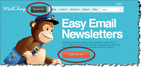 One of the most important parts of every website are Call to Actions, because they are what gets someone to Do something on your website.
It’s it imperative then, to make your call-to-actions stand out on your website (check out this website as an example) 3 things are important in your CTA’s:
- Verbiage – Use words that create action “Click here,” “Sign Up,” or opt for positive/personal language like “Get My Free Copy” or “I want to make more money”
- Color – There are many colors that make for good CTA’s: red, green, blue, yellow, orange…. However, there are some you need to avoid: brown, pink, black.
- Spacing – Having the proper spacing or padding around your CTA is important to make it stick out from the rest of the page. Remember, you want people to click on your CTA not scroll past it. This leads us to #3…
3. Squint Test
Many professional web designers use what is called the “squint test” to make sure that their Call- to- Actions sticks out on the page. How does the test work?
- Look at your web page and see it through squinted eyes (make sure things are very blurry).
- Identify and ensure that only 1 major thing sticks out because of color, size, and spacing on the page (this 1 major things should be your CTA)
4. Spacing, Easy To Read
This is basically the same principle as #2. The days of HTML web pages, with long paragraphs of text, are gone. Modern web design should focus on creating smooth layouts that contain elements that are easy to focus on. This requires spacing.
In other words, instead of having 500 words of text all in one paragraph break it up into several paragraphs. If you want to take it to the next step, give each smaller paragraph a bold title heading.
You want to make sure elements–like pictures, paragraphs, buttons, etc– have enough space between them so that they don’t all get jumbled together and ignored by the viewer.
5. Conversational
One of the best ways to begin designing your website is to sit down (either by yourself or with another person) and explain who you are as a company and what you do. Record yourself or write what you say down.
Why do this? Because, your website is a conversation with the viewer.From the first moment someone arrives on your website you should be having a conversation with them, explaining either who you are or what you do.
Your website is a salesperson. It should sell what you do 24/7 and the conversation should clearly flow from section to section and page to page.
6. Website Copy and Pictures/Videos are the most important parts of your website
 Most people underestimate this. They think: “well, I’ve got a mission statement and a logo and a sentence about each one of my services so I’m ready to build a website.”
Wrong.
The copy (“text”) and visual pieces of your website are the website. It’s what separates your website, your service, and your company from the competition. You need to have a unique message and engaging pictures that stand out.
7. The Most Important Things go in the Most Important Places
One common problem of many websites is that they struggle to put what it is they are trying to “sell” in places where online visitors will see them.
If you want someone to buy your Sun Glasses then you need to make sure the CTA or link that leads to them is seen immediately by visitors who come to the website.
Another example: let’s say you really want people to sign up for your newsletter/email list. Then you need to make sure some opt-in or signup form to do so is easily seen on your sidebar or as a pop-up.
One Comment