
Building a website is exciting, but it can also be overwhelming, especially if you’re doing it for the first time. Before you start, it’s essential to know some tricks that can make your website look amazing, because you’ll want something pretty magical that’s going to convert or keep people eniticed or on the website. In this blog post, we’ll explore ten straightforward tips that cover everything from colors to buttons, and more.
1. Color Choices (Color Palette):
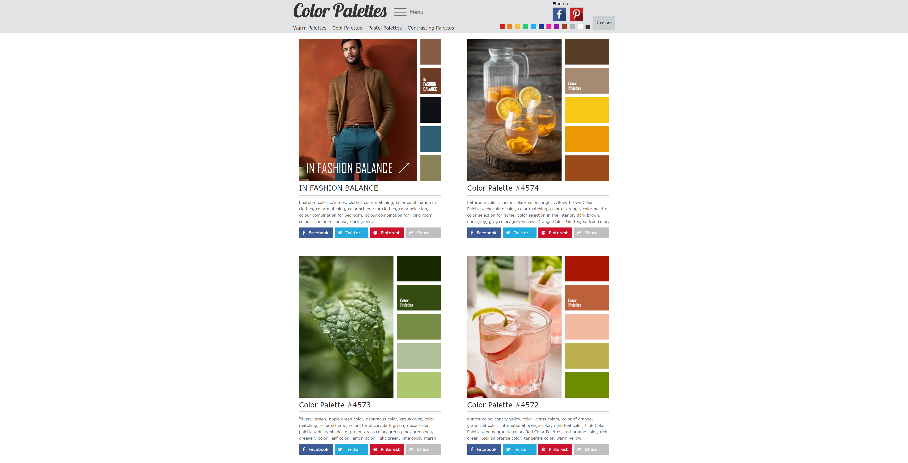
So our first design tip is about picking the colors for your website, otherwise known as your color palette.
Imagine your website is like a painting, and the colors you choose are the paint you use. If you don’t have a plan for which colors to use, things can get pretty crazy and confusing. So, let’s say you like black. Cool, but are you gonna add some gray and white to go with it? That way, you get a nice mix.
Or maybe you’re into a bold red, like a really bright red. Great! But what other colors are you gonna use with it? Choosing the right colors is super important, and I suggest checking out sites like colorpalettes.net. They help you pick a couple of colors and show you lots of pictures that use those colors.
Now, why does this matter?
Well, let’s say you want to use the colors blue and yellow. If you see a picture with mostly blue and just a little bit of yellow, it tells you something. You might want to go, “Hmm, we can use a lot of blue and some lighter shades, and we’ll save the yellow for important stuff like buttons or headlines.”
The key is to balance the colors. But if you just throw a bunch of colors together without a plan, your website might end up looking like a messy rainbow. And trust me, that can be a headache, especially on a phone. So, always keep your color plan in mind.
2. Keep It Simple (Whitespace) :
Tip number two is about keeping your website neat and tidy.
Imagine your website is like a room. Do you want it to be super crammed and cluttered with stuff everywhere, like a magazine or a news website with a million things going on—grids, small squares, big squares, links, icons, you name it? If that’s your vibe, cool, go for it. But, for someone new visiting your site, it can be overwhelming, especially if they’re just checking you out among many other tabs.
If your website is all cluttered and busy, it might work if you’re a news site or a blog about lots of different things. But if you’re trying to showcase your services or run a shop, it’s better to keep things clean. It’s like decluttering your layout. And when I say “white space,” I don’t mean your page has to be white. It could be any color.
The idea is to give your content some breathing room. You want your visitors to easily navigate your site and follow the flow of the page. Make it clear where the important buttons are, like “Buy Now” or “Contact.” Too much stuff can confuse them, and they might miss what you want them to see. So, embrace some space and don’t overload your page unless it really fits the purpose of your website.
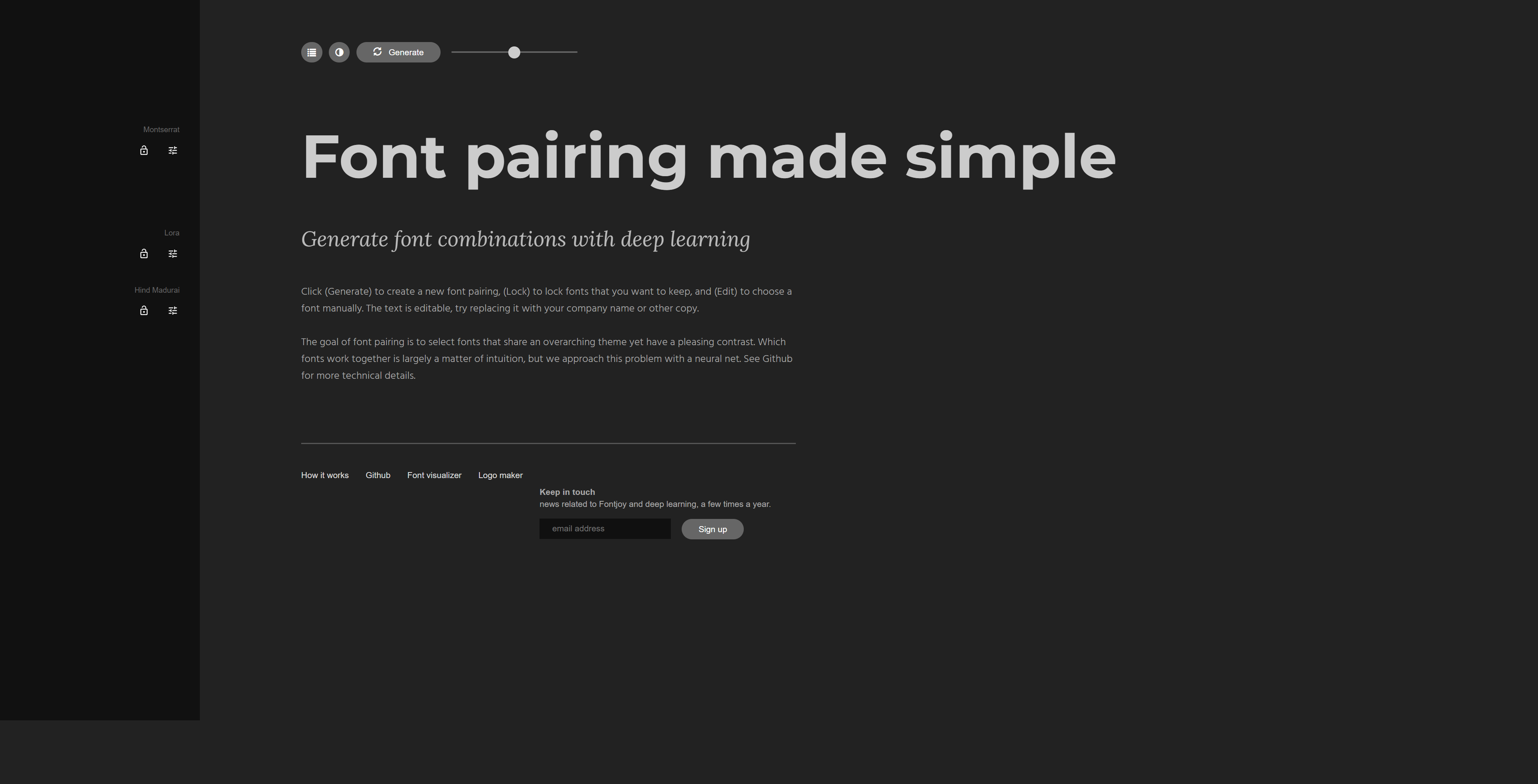
3. Fonts:
Let’s talk about the third tip, which is just as crucial as picking your colors—thinking about your fonts.
Have you considered what fonts you’re gonna use on your website? I highly recommend checking out fontjoy.com. It’s a cool site with a bunch of Google fonts, and it helps you figure out your main font, your secondary or subheadings font, and your body font. It’s free, and it generates font combinations for you to play around with.
Why does this matter? Well, if you choose the wrong font, it can work against you. You might fall in love with a fancy calligraphic or handwriting-style font, but is it easy to read on a mobile, considering the colors you’re using? Will everyone understand it, not just you?
Don’t just rely on your friends and family for opinions. Check out other websites, especially your competitors. See what fonts they use. They might have a fancy font for their logo, but notice how they keep the rest quite traditional and easy to read.
So, font choice is crucial. It can either keep people on your website or drive them away. Keep that in mind!
4. Images:
Now, let’s dive into tip number four, which is all about the photos and images on your website.
Here’s the deal—please avoid using blurry or grainy images. We’ve seen it way too many times where people, whether they’re consultants, service providers, or shop owners, use photos that scream “taken with a mobile phone” and not even a good one.
We get it, not everyone has perfect lighting or a professional setup, but if you’re snapping a pic with your phone, try to get the best resolution possible. After that, compress and convert it to webp format to save on file space and speed up loading times.
Avoid using images sent from WhatsApp or Facebook groups, as they tend to be grainy and low quality. Trust me, it stands out like a sore thumb on your website. And when it comes to photos of people, like team profiles, aim for consistency. I know it’s not always easy, but having a consistent look matters.
Don’t settle for a profile pic that looks like it’s from a decade ago and was just snatched from Facebook. Right-clicking and copying won’t do the trick because the quality will disappoint. So, keep the quality of your images in mind, and I’m not just talking about photos—this applies to all the images across your website.
5. Easy Navigation:
Let’s move on to tip number five, and it kind of connects with tip number two, which was all about giving your website some breathing room and making it easy to navigate.
Now, tip five zooms in on navigation. Where’s your menu? Can I find it without getting lost? Do I know where to click? And when I do find the menu, is it a chaotic mess? I’ve come across websites where the off-canvas pop-up is so jam-packed that when I click a dropdown, things start getting all tangled up.
Keep it simple, uncluttered, but also make it a breeze for me to hop around pages. Please don’t turn it into a puzzle. I beg you, avoid doing a dropdown within a dropdown within a dropdown within a dropdown because that just freaks me out, and I don’t want to spend ages figuring out your website.
Take a moment to think about your layout. How do I smoothly go from page one to page five or anywhere else? And don’t expect me to always scroll down to your footer; that’s a turn-off. We appreciate clean websites, but make sure it’s user-friendly for me to use your menu and navigate through your site.
6. Statements:
Now, let’s chat about tip number six. It might not apply to everyone, but if you’re running a shop or offering a service, pay attention. It’s easy to say, “Hey, check out our shop, buy our stuff.” But hold on a second— who are you, and why should I trust you? If you’re providing a service, what’s in your track record? Don’t just throw qualifications at me; I want to hear about your accomplishments, your projects, how you’ve made a difference in the world.
And if you’re a charity, what’s happening with the money you receive? Show me your brand, your goals, your mission. When I click on your “About Us” section, don’t just tell me you’re changing the world; give me something to believe in and invest in. Because if I believe in you, I’m more likely to support your cause or buy something from you. So, tip number six, even though it’s not a one-size-fits-all, think about crafting a compelling mission statement.
7. Call-to-Action (CTA):
Now, moving on to tip number seven, which is all about those call-to-action buttons. Here’s the scoop—please don’t stash them away at the bottom of your page. I’ve seen websites do that, and honestly, what made them think I’d scroll all the way down? Well, I did in that case, but it was a bit of luck.
Place your call-to-action button strategically—maybe in your hero banner or close by. Don’t let me miss it, and make it compelling. Skip the boring “contact me” or “buy now” phrases. Sure, you can still use them, but try to be dynamic and connect it to the purpose of your website.
Let’s say you’re an architect—how about “Let’s get building” or “Let’s start designing”? If you’re a logo designer, go for “Let’s get designing,” “Let’s nail that wireframe,” or “Let’s create that stunning image.”
Make that call-to-action button feel like you’re talking to me, you know? In real life, if you were chatting with an architect at a pub or on the street, they wouldn’t just say, “Get in touch.” They’d be like, “Let’s kick off the project. Let’s build it out. Let’s make things happen.” Okay, maybe not “bust a gut,” but you get the idea.
So, make sure your call-to-action button is higher up on the page because you want me to click, make the purchase, contact you—do something. But do it with enticing and engaging words.
8. Consistency:
Now, let’s dive into my precious tip number eight—aim for consistency across your entire website. If page one is rocking the blue vibe, don’t throw in red on page two unless it genuinely fits your brand and purpose. Mixing up colors without a good reason will only create confusion.
Avoid sudden font changes unless there’s a major, well-thought-out reason for it. Maybe you’re highlighting a special one-off product or something. But in general, don’t mess with the colors, fonts, or layout randomly. Picture this: I visit your homepage, love the layout, and then I click to page two only to find it looking completely different, like it’s jumped from one style to another.
Don’t let your other pages feel like an afterthought. Don’t be like, “I’ll deal with them later in life.” No, sort it out now. Keep the look and feel consistent unless a specific page or promotion demands a unique touch, and you can explain why. Otherwise, strive for that sweet consistency throughout your website.
9. Responsiveness (Mobile-Friendly):
Let’s talk about tip number nine—mobile responsiveness. Seriously, don’t overlook it, whether you’re starting from your desktop or diving into mobile-first design. Don’t just build a stunning ten-page website on your desktop and then turn a blind eye to the mobile view where fonts shrink, images get lost, and everything feels cramped and cluttered.
Even if your client insists, “I don’t really care about the mobile view, just make it look incredible on the desktop,” you need to step in and say, “Hold on!” More people are checking out websites on their smartphones than ever before. Yeah, I know that “than ever before” phrase can be a bit overused, but it makes sense. More people, more smartphones, you get the drift.
So, don’t sideline mobile responsiveness; nail it down. Make sure it works seamlessly because, let’s face it, a website that looks amazing on a desktop but falls apart on a mobile is a big no-no.
10. Contact:
Let’s wrap it up with tip number ten—don’t play hide-and-seek with your contact info. If I’m on your website, liking what you’re doing, and I’m eager to either buy or reach out to you, make it a breeze for me. Where’s the contact form? Oh, it’s hidden somewhere, making it a challenge to find. And the phone number? Nowhere to be found. Is there an email address? Sure, but it seems ancient, and I’m not sure it’s still in use because I haven’t heard back in three or four days.
Make it simple for someone to reach out to you, either with a clear contact form or by having it prominently placed in your navigation menu. No need for mystery-solving like Scooby Doo—we just want an easy way to contact you. So, there you have it—my ten tips on web design.
Conclusion:
These ten web design tips lay the groundwork for crafting visually impressive and user-friendly websites. Every aspect plays a part in enhancing the user experience, whether it’s the color palette, layout, or user-friendly navigation. Share your insights, extra tips, or personal experiences in the comments section. Enjoy the design process!