If you’re not a designer, making your website visually appealing can seem an impossible task. You already know it’s a pretty critical factor in creating trust, because it’s what you look for yourself.
This article breaks down the 4 basics to great visual design for any website, anywhere:
- Design & Color
- Pictures & Graphics
- Usability
- Consistency
So where do you start? What colors do you use? What kinds of pictures to use, or not use?
‘Beauty in the eye of the beholder’ goes only so far. It actually breaks down when there’s no underlying set of principles. Which means there are 4 basics. Build on those, and then you can go to town.
Communicate Credibility
Within a culture (created either by time, space or industry), a language is a set of rules for effective communication.
You can have an amazing product, but if no one understands what you’re saying, then you won’t sell it. And if you want to package your brand, product or idea in a way that communicates care, quality and trust, you have to nail the 4 basics.
Get this: According to the Stanford Persuasive Technology Lab, 46% of site visitors say a website’s design, including font size, color scheme, layout, and site navigation, is the #1 criterion for discerning the credibility of the company.
That’s almost half.
And according to 3M, human beings process visuals 60,000 times faster than text.
This means that within a fraction of a second, half of all your visitors decide that they can’t trust you – purely based on what they see, and not what you say.
You can’t afford to be losing half your site visitors every day.
So how do we fix this? Let’s dig into the four key features that make a website visually appealing.
Design & Color
The first step to making a website visually appealing are the colors you design with. It’s what first catches your eye as you bypass a bus. It’s what makes you pause when flipping through your Facebook feed.
Color catches the eye, and provides an instant layer of communication. Even before the conscious mind has started thinking, the subconscious has already assessed if something is interesting or not. Purely based on colors.
Our brains are sense-making machines. They like to organize stuff so that it can be processed. But the subconscious communicates in impressions, it intuits whole realities that your mind has to break down later. That’s the world of color.
Here’s an infographic that gives a good sense of how color implies meaning:
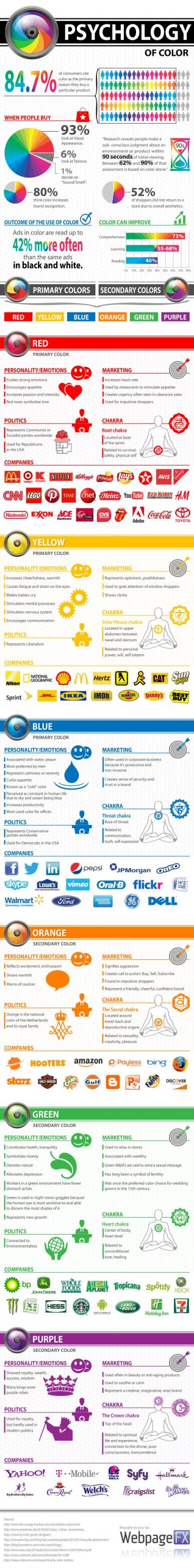
That’s why sites with cluttered colors, competing color schemes, or garish color choices don’t instill confidence.
A cleanly laid out website with a clear color scheme tells your visitor that care has gone into the presentation. It’s why we love the unboxing experience of our new iPhones.
That kind of giftwrapping tells us something about the device, and the experience we’re going to have with it, even before we see or use it.
According to a study conducted by Adobe, more than 66% of web users judge a website on the quality of its graphics, within the first 15 minutes of landing on the homepage. (Cloudwards)
In a nutshell, the more attractive people find your website, the higher your chances are that they will stay a little longer. That means you have higher chances of converting them.
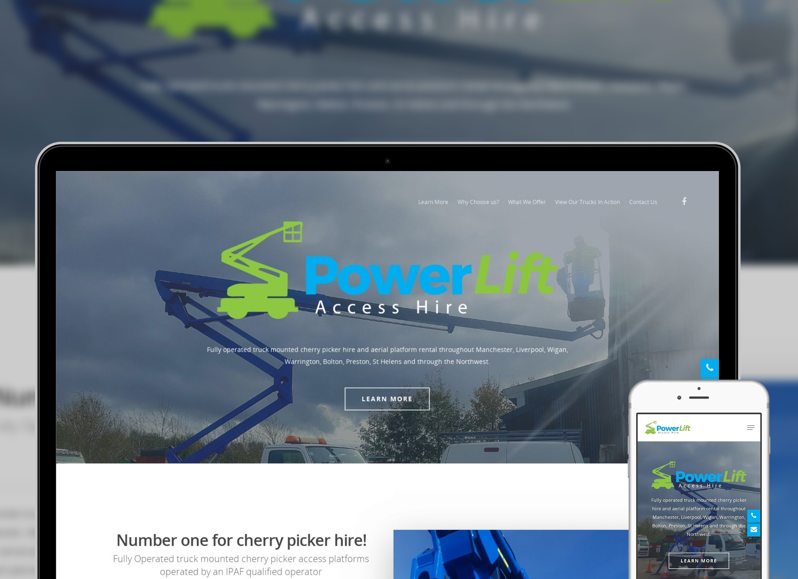
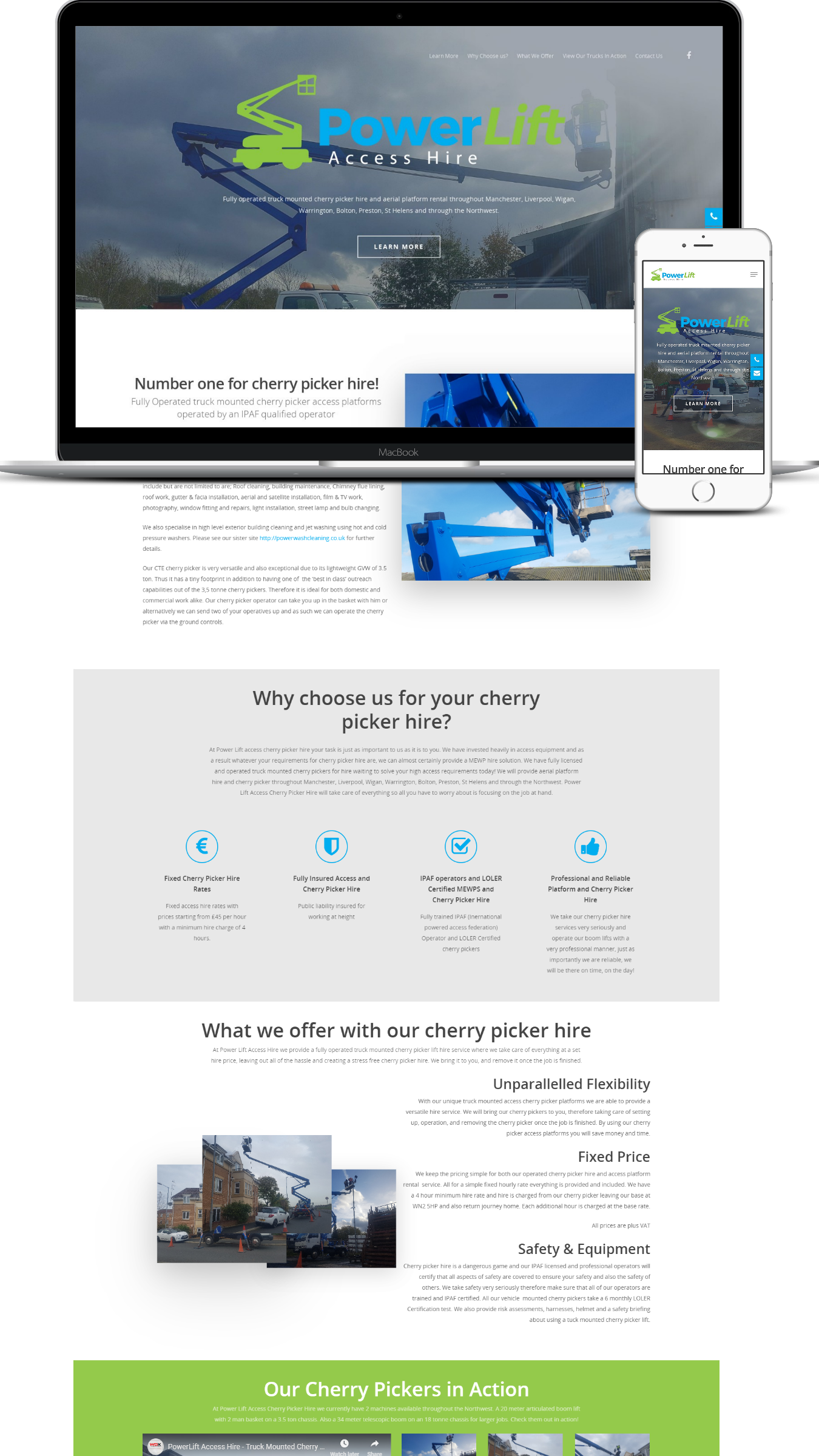
Check out some examples of sleek, visually appealing websites.
Pictures and Graphics
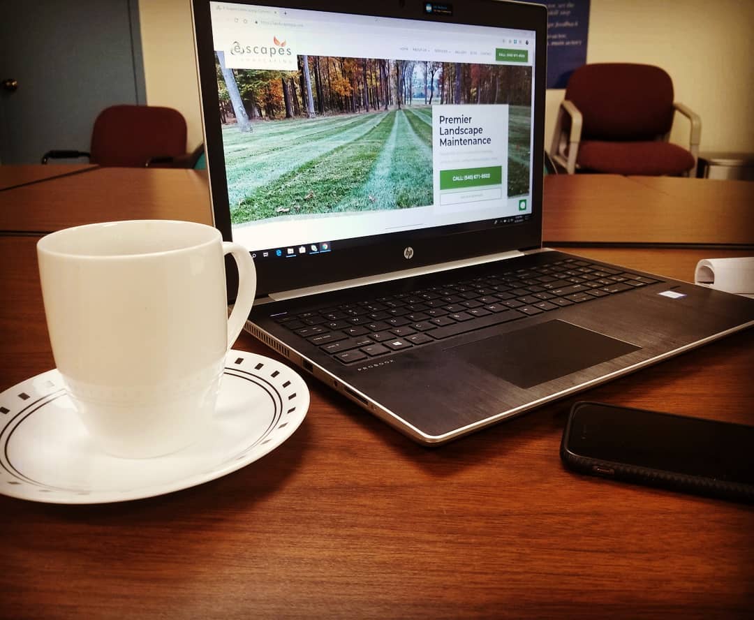
The stock art trend has passed its heyday, as more and more of us small businesses can take our own pictures.
It’s no longer cost prohibitive to hire a photographer to take pictures of your office and your team – if it’s you and your iphone. And if you have a good eye, your photos can go a long way toward communicating an authentic, solid first impression.
Overtly stock photos look fake. And their overuse means that we can spot them a mile away. Our BS filters are extremely sensitive these days, to quote Gary Vaynerchuk.

That means if your first impression is that you’re not real, why should anyone trust that your service is real?
If you can do it, invest in a professional photographer and you will blow away your competition. Your website and all your marketing collaterals will instantly transform.
You will not only save money (because your designers will have an easier job of everything) but most importantly, solid, engaging photography communicates just how committed you are about care, quality and excellence better than any iphone or cheap camera. Or stock art.
The better the pictures, the better your business will look.
First impressions with websites really matter.
Usability
The wheel has been invented. Long live the wheel.
Websites too. Unless you’re catering to an avant-garde crowd, the rest of us need a website that is as easily laid out as your conventional Target. Or Walmart.
As soon as you step through the doors, the layout is simple;
- Checkouts near the front (ah, this place is about buying things).
- Ceiling signs indicating the sections of the store .
- A helpdesk even closer to the front than the the checkouts.
- Enough information for you to make your own decisions, and understand how things help you.
A great website is intuitive and usable to everyone. It’s taken us a decade or so, but most websites now have sifted out what works and what doesn’t, and here are your general areas for great usability:
- Immediately communicate your purpose, with clarity and an inviting tone.
- A simple, clear menu that organizes the pages of the site, with the most important first. Nothing cutesy.
- A ‘help desk’ feature, either with a contact page, or contact details in the header and footer, or a livechat so that people can get help.
- Enough information to help your visitor understand how things help them.
- A layout focused on ease of use, and ease of reading.
Keep things simple and to the point. And don’t spend all your time talking about how amazing you and your services are.
Imagine walking into Target, and the first thing to greet you is a Guide named Lashawne Williams, who stops you in your tracks.
And then tries to take up a half-hour of your time talking about his experience, how much he’s going to love working with you, and why you should keep Target first in your mind.
And all you’re thinking is: “I just wanted milk, shoes and a throw rug.”
Your site should not be focused on what you think you want. It must be customer-first. Make it easy to use:
- Make your menu/site navigation prominent, and simple.
- Keep your content distinct from other elements, and easy to read.
- Make your buttons stand out. They’re where the action happens.
- Decide what is most important on any page, and then give it prominence. Don’t give everything the same attention.
- Don’t put too much on the same page/screen. The more you include, the more you split your visitor’s attention.
Consistency
Consistency is often forgotten. Especially by particularly creative people. Consistent design allows the user to focus on the message.
An inconsistent layout means that every page forces the visitor to stop, relearn the language, and then get back to absorbing what’s important.
A couple of years back, I was taking a course in writing, and one of the assignments had me study an issue of ‘Highlights’, a kids’ magazine. I was blown away by the sheer chaos on every page.
Every photo was at angles, the text was everywhere, and mangled by different sizes, colors, and intruding shapes. I felt exhausted just trying to decipher everything on one page.
And then I realized that their choice to do that was very clever. Our brains are ‘sense making machines’, so we see something that we know is valuable to us (like a kid knowing that this magazine is going to be fun), and we put energy into studying and organizing it all.
But what if you aren’t yet convinced that it’s important to you?
We see sites like this all the time; they’re crammed with ads and content, and each page is laid out differently. A visitor takes one look, within 7 seconds decides that it’s going to take too much effort, and leaves to find a website that’s easier to absorb.
So what makes for consistent design on your website?
First of all, decide your three tiers of of importance: primary importance, secondary importance, and then deeper detail.
Your headlines and above-the-fold area should convey the content with primary importance. Then look at the rest of your page, and structure it so that someone scanning it gets a clear sense of what’s there to consume.
With your website, be careful about ‘underlining’ everything. Because when everything is underlined, nothing is.
And also be careful about not underlining things enough. Because then once again, everything fades into a grey miasma, forcing the reader to stop, and engage more than they have energy for.
It’s too easy to lose them.
So design a layout that’s easy to see, has strong contrast between your elements, and highlights the most important points. Once you’ve decided that ‘language’, keep that going throughout the rest of your website, and all your marketing collaterals.
For example;
- all your quotes might have a solid color background. Do that everywhere.
- All your headings might be a certain size and color. Keep it consistent.
- Your images might look good greyscale. Make a brand choice, and then stick with it everywhere.
At the end of the day, consistency in your website creates trust, because it means you’re not disorganized.
Your visitor can trust that your service is as coherent and well constructed as your website.
Note
Sometimes you need more depth and discovery before entering into a full build. That’s when you need to back up and look at things like wireframing, prototyping, and information architecture. Check out 5 Must-have Steps When Designing a Website for Conversions
Let’s Sum Up
Design & Color
A visually appealing website starts with solid design, and a conscious color scheme.
Good design instantly communicates competency, care and credibility. Poor design triggers apprehension, and can shut down interest within 7 seconds. That’s not even long enough to say ‘Hi, I’m Joe, and I can save your world with this incredible–“
The colors that you use resonate with different feelings, and can trigger different responses.
When defining your brand, carry that over onto your website to create a holistic experience of you and your company. Think about the response you want to elicit, and select the colors that help make that happen.
Try Canva’s Color Wheel to help make your designing process easy and efficient.
Pictures & Graphics
Good photography brings instant visual appeal, class and quality. It’s still unusual today for a website to have well composed and well lit photos of teams and their offices. This is the easiest step to one up your competition, and help build trust with your visitors.
Take the time to avoid overtly ‘stock art’ material, and with a little effort up front, you and your iphone could help your website close the gap between you and your visitor.
Usability
Keep things easy to understand, and conventional. Don’t get cute with names, like ‘join the Pub’ instead of ‘Blog’, or ‘Main Lobby’ instead of ‘Home’ page.
Make your buttons distinct, your menu clear and simple, your page layout focused on what’s most important, and a clear attention to readability.
Consistency
Once you’ve set up a ‘language’ for how to interpret your brand’s elements (text, photos, quotes, etc), use that layout everywhere.
Being consistent with your design language means that your visitors can spend less time trying to understand how you’re saying something, and have more time to absorb what you’re saying.
So, what out of all this resonates with you most?
If anything on here helped you, drop a link below to your reworked website! We can keep the feedback going, and increase your visitor conversions.
2 Comments